CONCEPTUAL BRANDING & MERCH DESIGN
Pride Niagara
🌈 Pride Niagara is a not-for-profit organization that fosters social connectivity by organizing diverse events and advocating for safer spaces for the 2SLGBTQ+ community in the Niagara region of Ontario, Canada.
-
This was a passion project for Pride Niagara. The work presented is conceptual and not official to Pride Niagara.
-
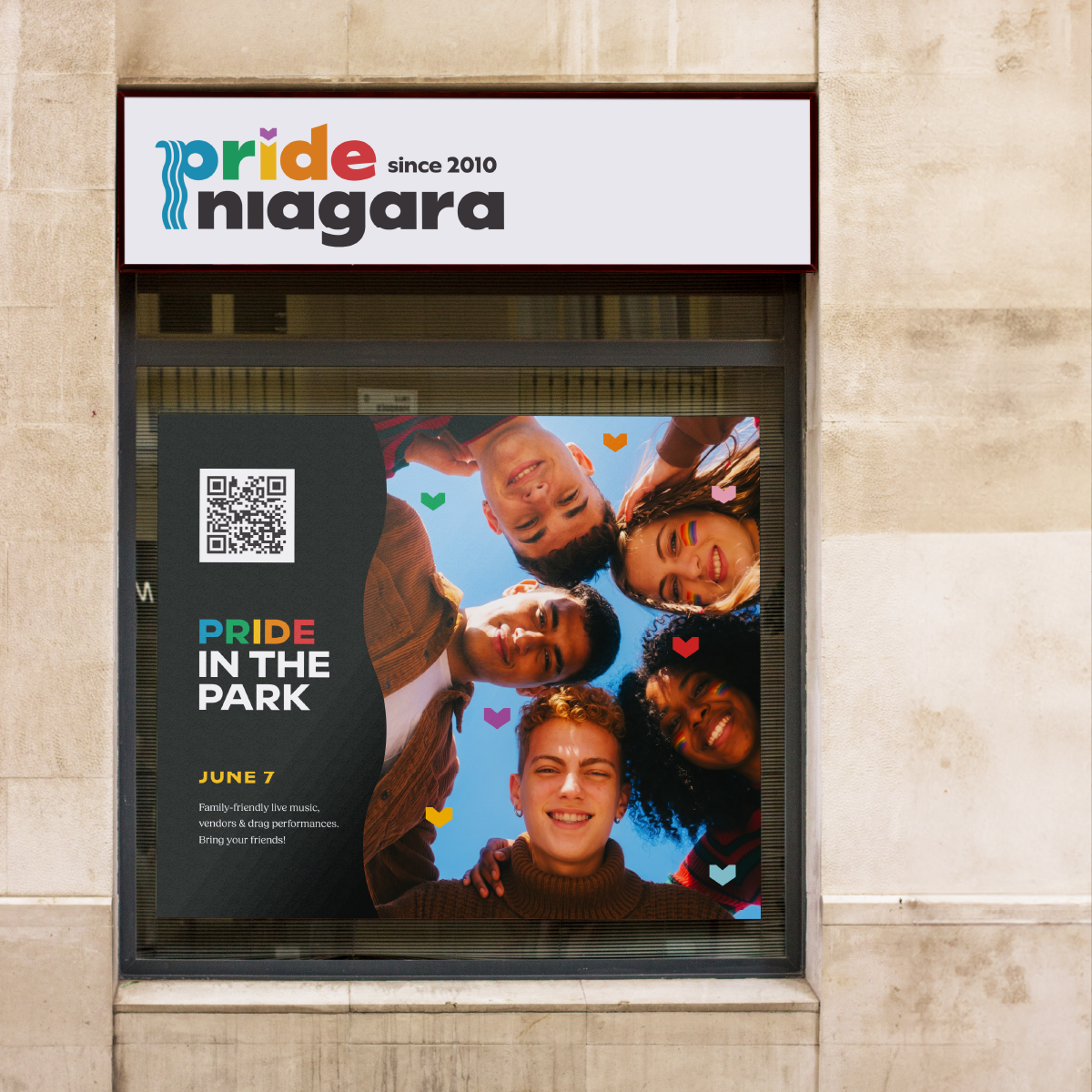
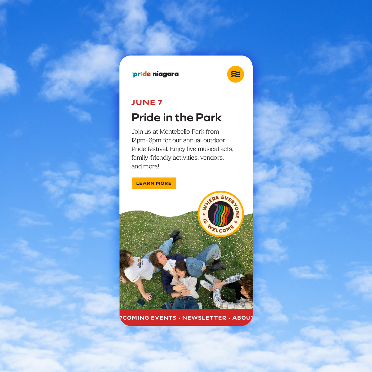
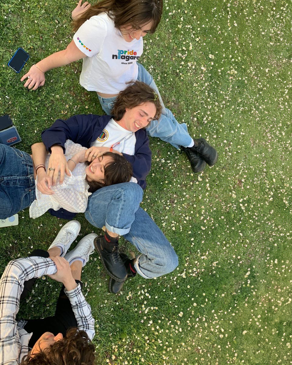
Stock photography from Unsplash.
Project Goals
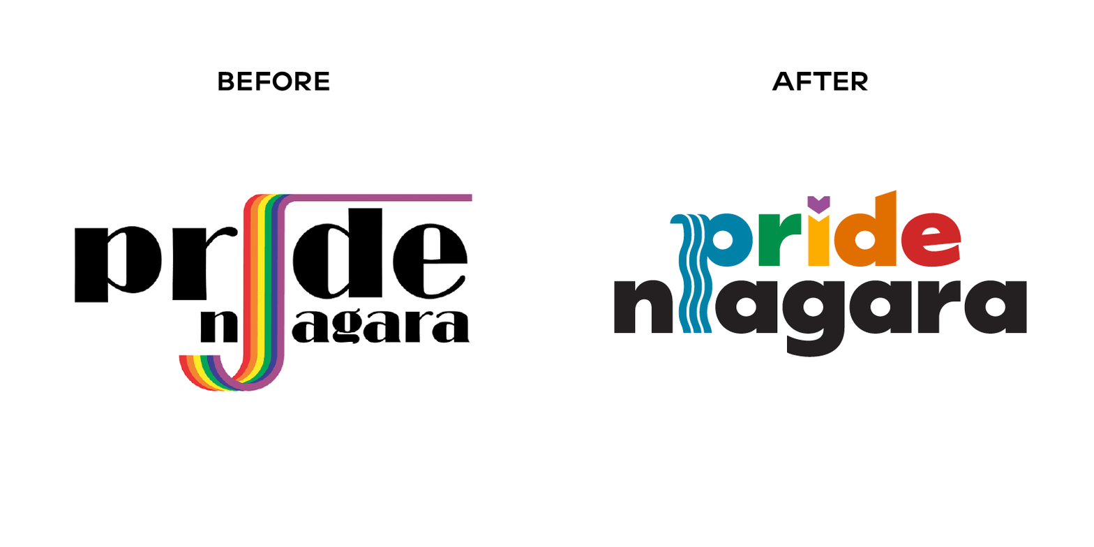
Pride Niagara has had the same logo since 2010, and while it is definitely outdated, hard to read, and ever harder to use (because they only have one logo!) the lack of branding has been quietly getting in the way of who they reach and how they’re funded.
Youth aged 15–24 make up roughly 30% of Canada's LGBTQ+ population.
→ This means if the branding appealed to Gen Z, their largest (and most vulnerable) demographic would feel safer, more welcome, and be more involved in community events.
As a not-for-profit, Pride Niagara relies on volunteers, donations, grants, and fundraising.
→ A versatile brand people actually want to wear (think merch!) would help fund their work while growing brand awareness at the same time.
The Vision:
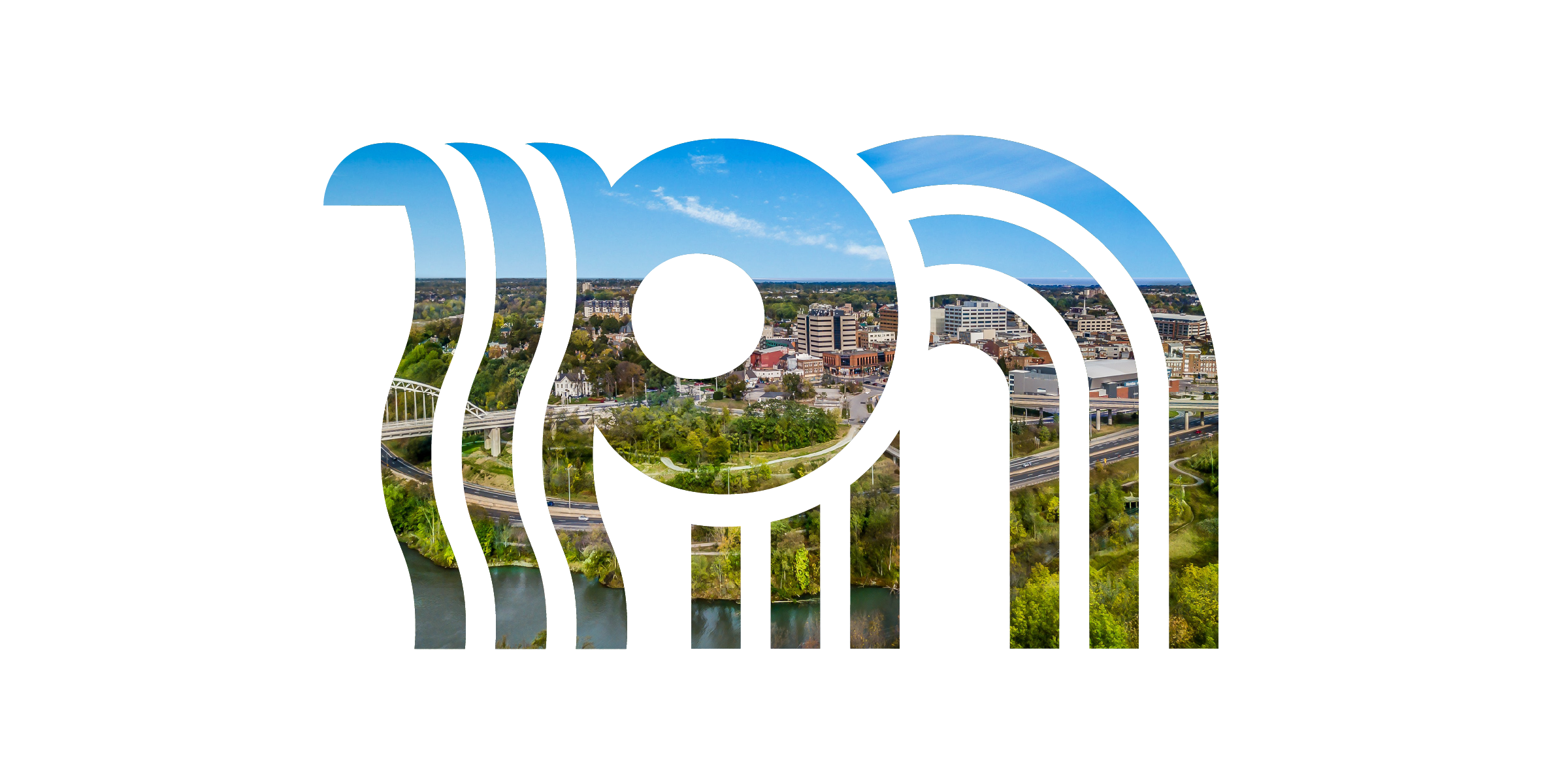
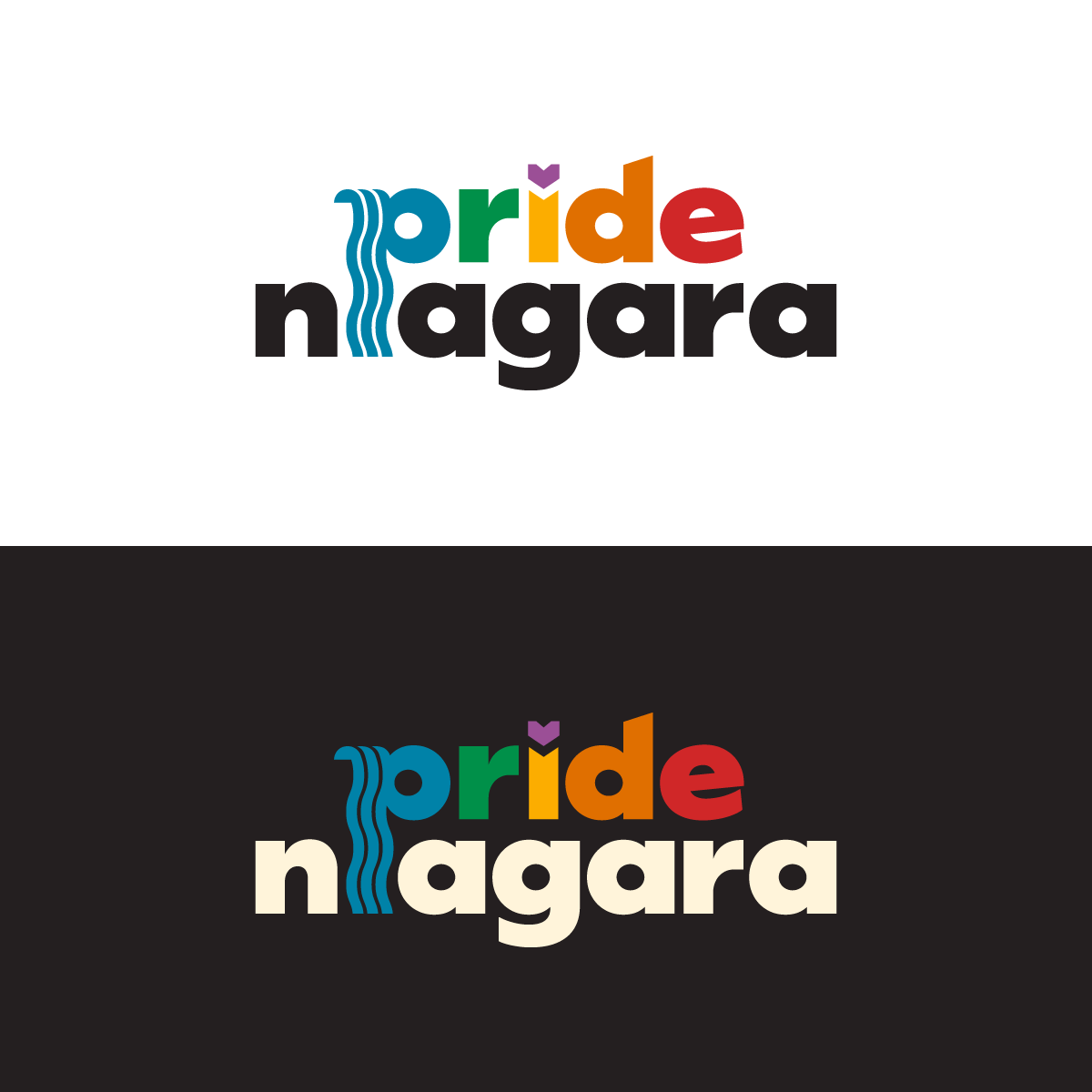
Refresh the rainbow waterfall concept and make it easier to read.
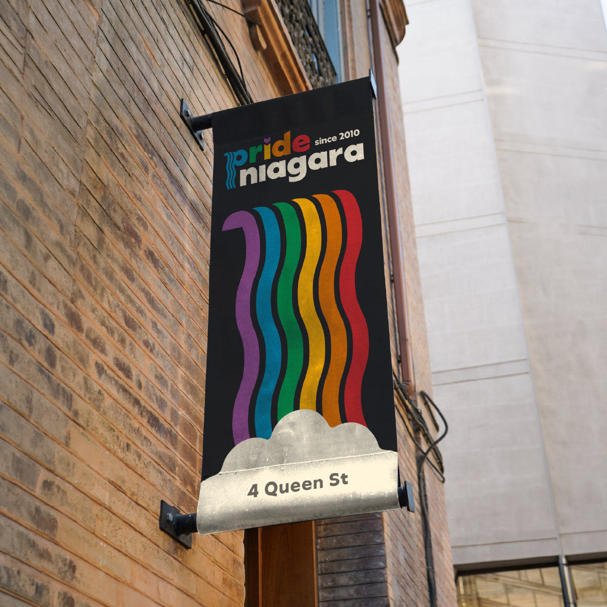
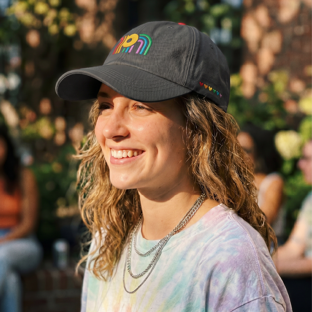
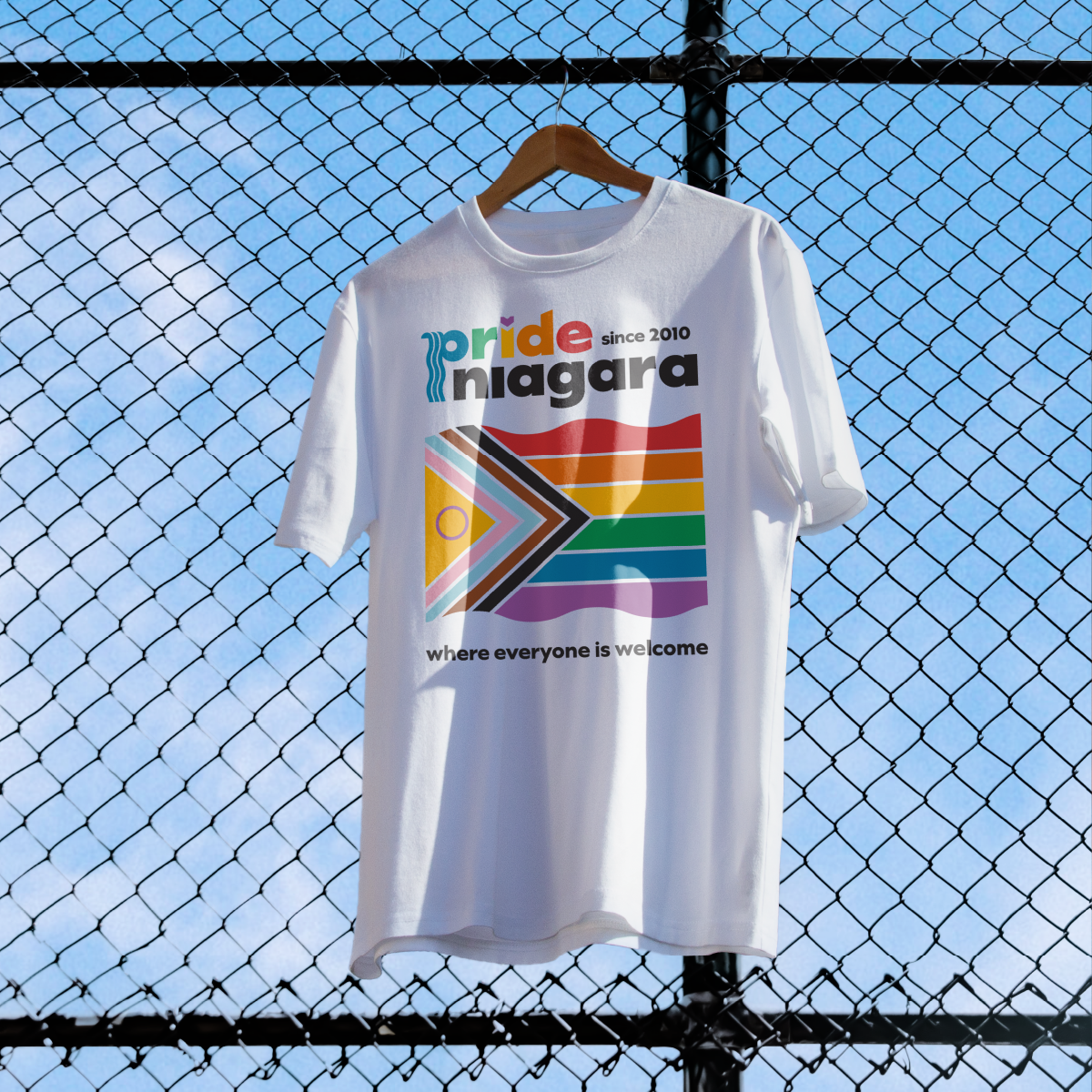
Create a versatile brand identity with different logo options that people would actually want to wear.
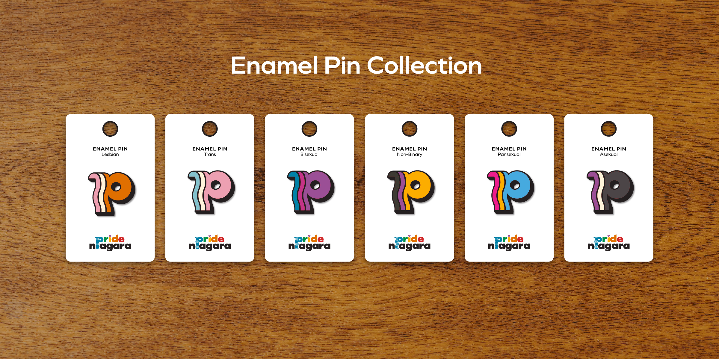
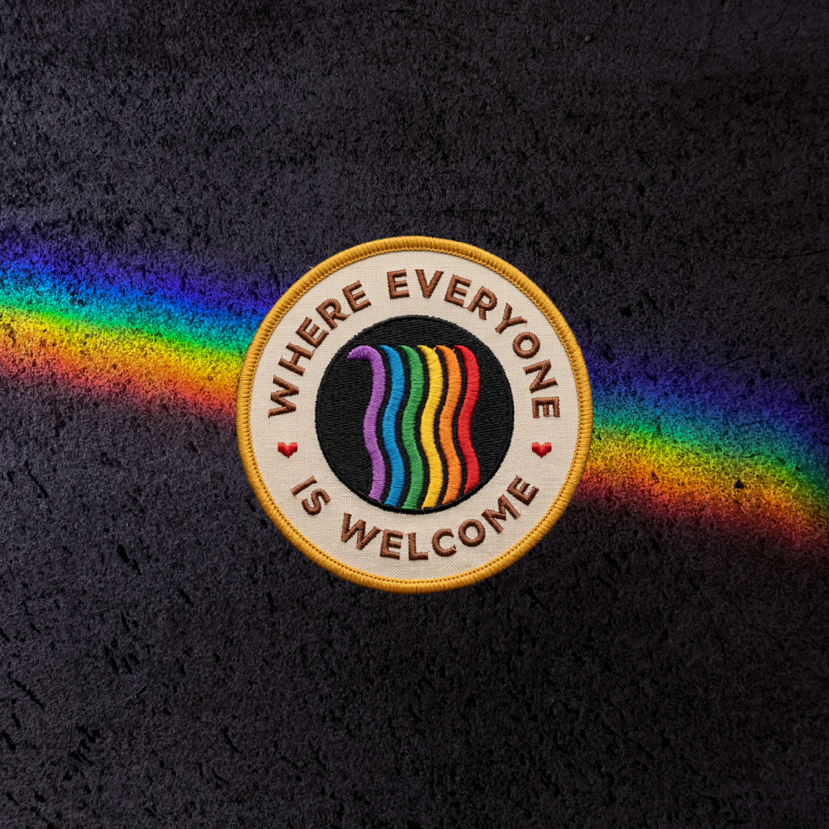
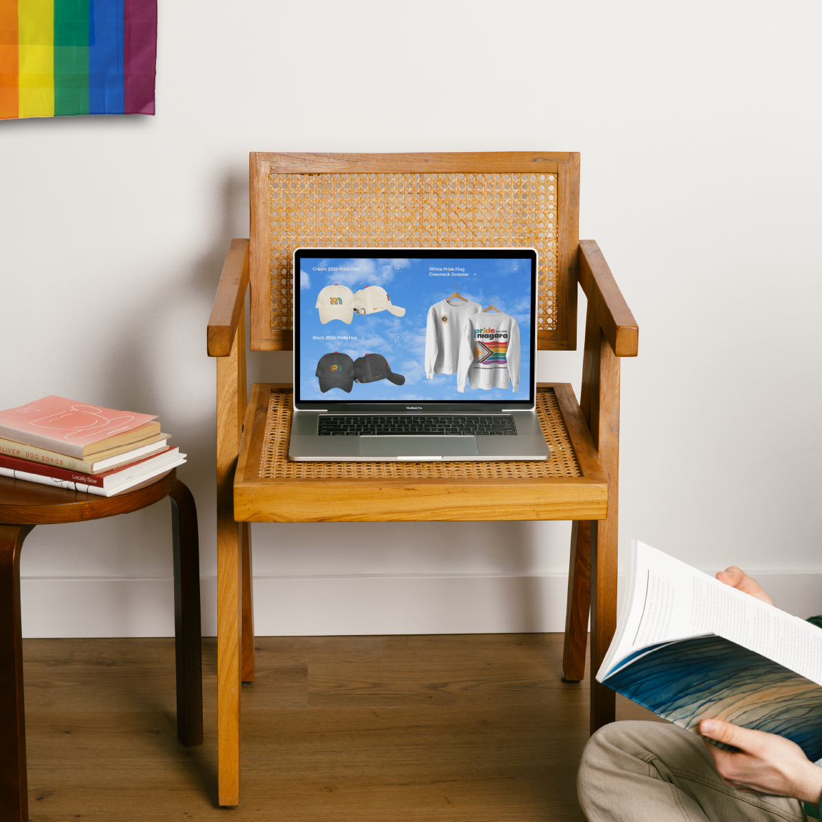
Develop a line of merchandise (t-shirts, hats, sweaters, stickers, pins & patches) to help fund Pride Niagara’s mission and reach more people.